A simple PowerPoint infographic that transforms numbers into a visual story.
When you’re presenting ideas, numbers alone rarely capture attention. A well-designed infographic helps people understand information much faster, especially when the goal is to explain a process, compare results, or highlight key metrics.
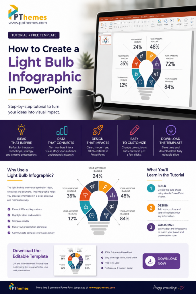
One of my favorite infographic layouts is the light bulb design. It’s simple, recognizable, and immediately communicates concepts like innovation, creativity, growth, or new ideas. The best part is that you don’t need advanced design software to build one. PowerPoint already includes everything you need.
In this tutorial, I’ll show you the basic concept behind this infographic and how you can recreate it yourself. If you’re short on time, you can also download the finished editable template at the end of this article.
Why Use a Light Bulb Infographic?
There is a reason why this type of infographic appears in so many business presentations.
The light bulb is universally associated with ideas, innovation and problem-solving. Instead of showing six disconnected statistics, you organize them inside a single visual element that tells a story before anyone even starts reading.
This layout works particularly well for:
- Presenting business KPIs
- Innovation workshops
- Marketing strategies
- Startup pitches
- Product launches
- Sales presentations
- Education projects
- Consulting reports
- Creative proposals
Because every section surrounds the bulb, your audience naturally follows the information around the graphic without feeling overwhelmed.
What You’ll Learn in the Instagram Tutorial
If you found this article through Instagram, you’ve probably already seen the speed tutorial where I recreate this infographic completely inside Microsoft PowerPoint.
Although the video is short, the design follows a few simple principles:
Instead of drawing a complicated illustration, the infographic is built from basic PowerPoint shapes. Each segment is duplicated, rotated, recolored, and combined to create the circular structure around the bulb. Icons and percentages are then added to transform a simple graphic into a professional presentation slide.
The tutorial is meant to inspire you to experiment with PowerPoint. Many people underestimate how much can be designed using only native PowerPoint tools.
Why This Design Works
A good infographic isn’t about decoration.
Its purpose is to reduce cognitive effort.
Instead of forcing your audience to read a table full of percentages, the design groups information into colored sections that are easier to scan. The eye immediately notices the colors, icons and hierarchy before reading the details.
The result is a slide that communicates information faster while looking much more professional.
Tips to Customize This Infographic
One advantage of building infographics in PowerPoint is that everything remains editable.
You can easily replace the colors with your company branding, change the icons, modify the percentages or even duplicate sections if your presentation requires more information.
I also recommend using simple icons and limiting each section to one short headline. The visual should support your message, not compete with it.
Small adjustments like consistent spacing, aligned text and a balanced color palette make a huge difference in the final result.
Download the Editable PowerPoint Template
Learning how to design slides is a valuable skill, even if you don’t plan to build every presentation from scratch.
Understanding the process helps you customize templates more effectively and gives you more confidence when creating your own slides.
However, if you’re working against a deadline or simply prefer to start from a professionally designed layout, you don’t have to recreate everything manually.
You can download the fully editable PowerPoint version of this light bulb infographic and customize it in just a few minutes. Every element is vector-based, fully editable, and designed to work in Microsoft PowerPoint without additional plugins.
Final Thoughts
PowerPoint is much more than a presentation tool.
With a little creativity, basic shapes can become professional infographics that communicate ideas clearly and make presentations more engaging.
Whether you decide to recreate this design after watching the Instagram tutorial or download the editable template, I hope this article encourages you to explore what PowerPoint is truly capable of creating.
Happy designing!

GIPHY App Key not set. Please check settings