If you’re still using the same slide styles from 2020… we need to talk 😅But hey, don’t worry—it’s not all lost. You can absolutely keep using those PowerPoint templates I designed with a lot of love back then… they just need a little refresh.
Presentation design in 2026 is evolving FAST. It’s no longer just about making slides “look pretty”—it’s about creating experiences, telling stories, and keeping attention in a world where everyone is distracted.
And yes, Microsoft PowerPoint is still one of the most powerful tools to make it happen (if you know how to use it right).
Let’s break down the biggest trends shaping presentations this year—and how you can actually apply them.
1. Minimalism… but Smarter
Minimalism isn’t new. Long before Apple made it mainstream with its iconic clean design, it was already shaping art, architecture, and culture. But when Apple embraced it, everything changed—we all started paying attention.
Since then, it’s been everywhere—not just in technology, but in the way we live and, of course, in presentations.
But minimalism today isn’t what it used to be. It’s no longer just about using less text or fewer elements. In 2026, it has evolved into something more intentional.
Slides are becoming cleaner, but also more strategic:
- One idea per slide
- A strong visual hierarchy
- Bold typography doing most of the work
💡 Pro tip: In PowerPoint, use large titles (40–60pt) and reduce body text to almost nothing. If you can say it in one sentence, do it.
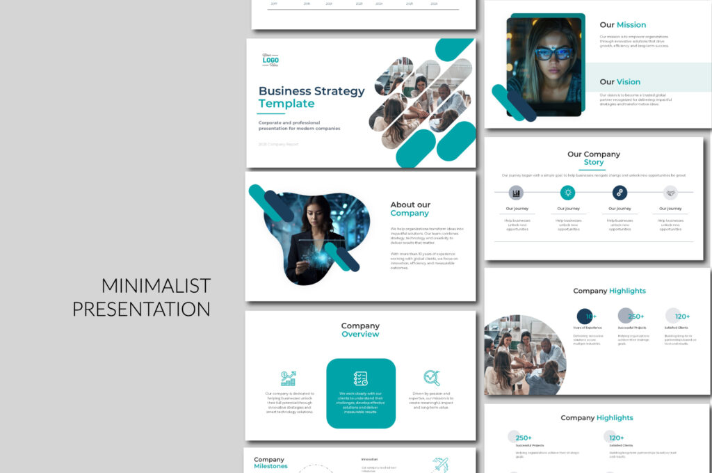
And of course, you can use our free minimalist PowerPoint templates—just don’t forget to adapt them to 2026 design trends. I’ll be adding a new one soon, designed from scratch, and I’ll come back to share it here so you can download it for free.
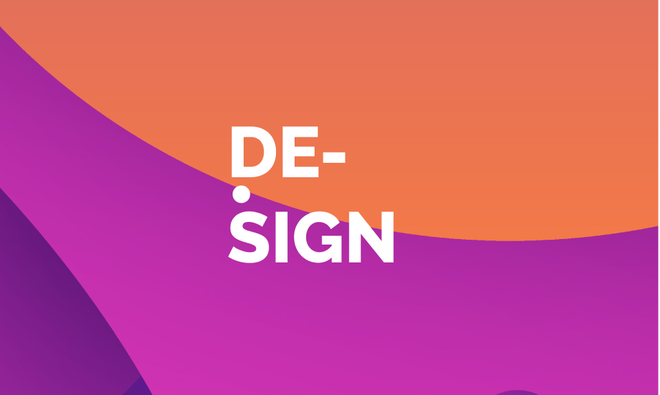
2. Big Typography is the New Visual
Forget icons overload. In 2026, text IS the design.
I have to admit—this is one of my favorite trends this year. I love experimenting with fonts and playing with different styles… but the real magic?
Big typography.
When you use large, bold text, your slides instantly feel more powerful, more modern, and way more intentional. It’s not just decoration anymore—it becomes the design.
Right now, designers are leaning into:
- Extra-large fonts
- Contrasting weights (bold + light… obsessed)
- Short, punchy phrases
This trend works especially well for:
- Pitch decks
- Marketing presentations
- Social-style slides
But honestly? Don’t limit yourself.
Big typography isn’t just for these categories—it can work almost anywhere if you use it with intention.
Now, here’s something important—this trend isn’t just about aesthetics.
It’s actually perfect for your audience because it:
- Improves readability
- Looks amazing on mobile
- Grabs attention instantly
And let’s be real—
attention is the hardest thing to win… and the most important.
More than the design itself, what really matters is this:
👉 Can you capture your audience’s attention in the first few seconds?
Because if you do that… everything else becomes easier.
And for this trend, you can totally use our Design PowerPoint templates.
Not all of them follow this style, but in many of our designs you’ll find that bold, oversized typography we’ve been talking about—plus some really creative slides that help you make the most of it.
3. AI-Assisted Design (But Not AI-Generated Everything)

Source: Pritesh Jagani, “10 AI tools to create stunning presentations in minutes”, LinkedIn
We use it from the moment we wake up until the end of the day. It makes our lives easier—no doubt about that.
But here’s the truth…
AI can do a great job, but it still needs human touch to make it WOW.
Let’s be honest:
👉 The best presentations are not fully AI-made.
They are AI-assisted + human-refined.
Tools like:
- Microsoft Designer
- Canva
- PowerPoint Design Ideas
…can speed things up a lot. But they don’t replace taste, storytelling, or structure.
That’s where you come in.
💡 In 2026, the winners are not the ones using AI—they’re the ones who know how to direct AI.—They’re the ones who know how to direct AI.
4. Motion & Morph Transitions (Still Winning)
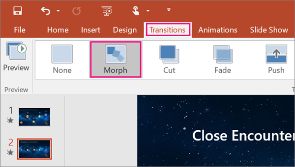
Yes, Morph is still THAT girl 💅
Honestly, it would be weird if it wasn’t on this list.
This is one of those trends I both love and hate.
I love it because it makes animations look incredible—smooth, modern, almost effortless. You don’t even need to be an animation expert. PowerPoint, with the Morph transition, basically does the magic for you… and it does it really well.
But here’s the thing…
After years of presenting (and watching a lot of presentations), I’ve noticed something: Many people overuse it.
They spend so much time creating these beautiful transitions… that during the actual presentation, they don’t land the way they expect.
Why?
Because audiences want to understand things quickly.
And sometimes, long or excessive animations can slow everything down—and people lose interest.
Still… it’s trending, and I’m happy it is 😌
The Morph transition continues to dominate because it:
- Creates smooth storytelling
- Makes presentations feel more premium
But here’s the 2026 upgrade:
👉 Less “look what I can do”
👉 More “this supports my story”
Use motion to:
- Reveal information step by step
- Guide attention
- Connect ideas visually
And of course… if you want to use this trend without starting from zero,
you can download our Morph PowerPoint templates.
We have a lot of options you can use—and yes… they’re really wow ✨
5. Real Content > Decorative Design
This is a big shift—and you can really feel it if you’ve been creating presentations for a while.
Before, slides were mostly decorative. The focus was on making them look nice, adding icons, colors, maybe some animations… and that was enough. But now, that’s not what people are expecting anymore.
Today, slides need to prove something. They’re not just there to support what you’re saying—they are part of the argument.
I’ve noticed that the presentations that actually stand out in 2026 are the ones that include real data, clear insights, and stories backed by actual cases. Especially in business or B2B environments, people don’t care about “pretty” slides anymore. They care about understanding fast, making decisions, and seeing results.
And honestly, this makes total sense. It’s not just a design trend—it’s how people consume information now. Even search engines and AI are prioritizing content that is useful, structured, and valuable.
So the question is no longer: “Does this look good?”
It’s: “Does this help someone understand, decide, or act?”
6. Dark Mode & High Contrast Aesthetics
Dark slides are trending a lot in 2026—and honestly, it’s easy to see why.
They just feel more modern, more polished… more premium. There’s something about a dark background that instantly elevates a presentation. Colors pop more, everything looks sharper, and it’s also much easier on the eyes, especially in longer presentations.
That said, I don’t think this is a one-size-fits-all trend. It really depends on what you’re talking about. Not every topic needs a dark aesthetic—but when it fits, it really works.
In tech presentations, for example, dark slides feel completely natural. Same with startup pitches or anything more creative—they help you create that sleek, high-end look that people associate with innovation.
But also… sometimes it just comes down to personal taste. If you like it, and it supports your message, why not?
At the end of the day, it’s not just about following a trend—it’s about choosing what helps your presentation feel right.
And if you’re thinking about trying this trend in your own presentations,
you don’t have to start from scratch.
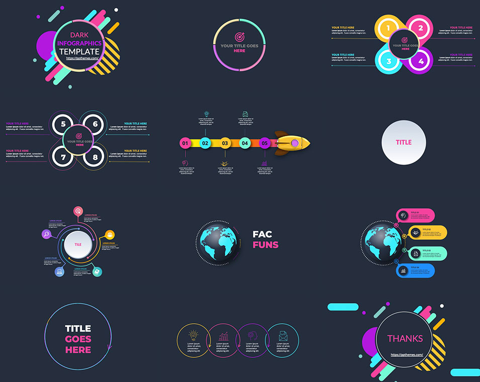
You can check out this template 👉 Dark PowerPoint Template with Animated Infographics
It’s a really good example of what we’ve been talking about—dark backgrounds, strong contrast, and animated elements that help guide attention without overcomplicating the design. Templates like this are designed to make your content stand out and keep your audience engaged, especially in business or tech presentations where clarity and impact matter most.
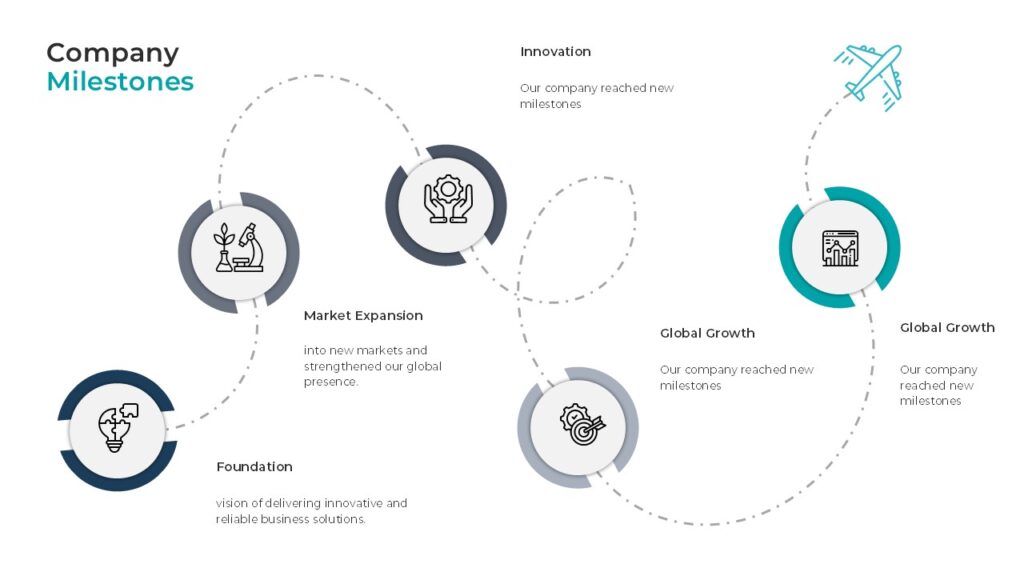
7. Modular & Reusable Slide Systems

This one is huge… and honestly, still very underrated.
I feel like not enough people are talking about this, but it’s one of the biggest shifts happening right now.
Before, most presentations were just a collection of random slides. You design one, then another, then another… and even if they look nice individually, there’s no real system behind them.
Now, things are changing.
More designers (and honestly, the ones doing the best work) are starting to think in terms of design systems inside PowerPoint. That means having consistent grids, defined typography styles, and reusable layouts that make everything feel cohesive from start to finish.
And this is where it gets interesting…
Because your presentation stops being just a file.
It starts feeling more like a product.
Something scalable. Something you can reuse. Something that saves you time and keeps your quality consistent.
And if you’re creating presentations often (especially for work, clients, or even selling templates like we do), this is not optional anymore—it’s what separates something that looks “nice” from something that feels professional.
And if you want to actually apply this way of working…
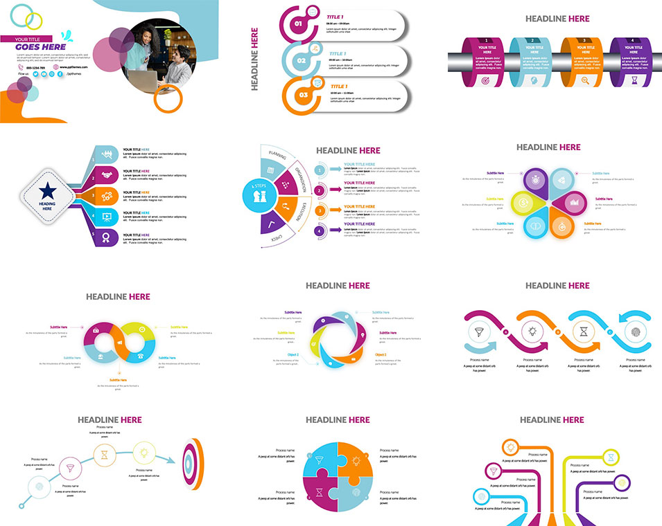
this is exactly how we build our premium templates.
Inside PPTBundle, our templates are not just a collection of slides. They’re built as complete design systems—with consistent grids, defined typography, and layouts that you can reuse over and over again without breaking the design.
So instead of starting from zero every time, you’re working with a structure that already makes your presentation look polished, cohesive, and professional from the first slide.
If you’re serious about your presentations (or you create them often), this will save you a lot of time—and honestly, it just makes everything look better.
8. Storytelling > Slides
Let’s be honest…No one really remembers your slides.They remember how you made them understand something.
And that’s why this is one of the biggest shifts in 2026.
Presentations are no longer built like documents.
They’re built like stories.
You can feel the difference immediately. Instead of jumping between disconnected ideas, everything flows. There’s a clear direction, a beginning, a middle, and an end.
I’ve noticed that the presentations that actually stick are the ones that follow simple but powerful structures—like showing a problem and then revealing the insight behind it, or taking people from a “before” to an “after.” Even something as simple as a journey or transformation makes the content feel more human and easier to follow.
And this is where a lot of people get it wrong…
They try to make the slides do all the talking.
But your slides are not the story.
They’re there to support it.
If your story is clear, your slides become stronger.
If your story is weak, no design can save it.
So instead of asking “What should I put on this slide?”
Start asking: “What am I trying to make people understand or feel?”
And if you want help building that kind of storytelling structure, you can explore these 👉 Creative PowerPoint Templates—they’re designed with flexible, narrative-style slides that make it much easier to guide your audience from idea to idea without losing flow.
So… What Should YOU Do?
If you want your presentations to actually stand out in 2026:
✔ Keep it simple—but intentional
✔ Use typography as your main visual
✔ Combine AI + human creativity
✔ Use motion strategically (hello Morph 👀)
✔ Focus on real value, not decoration
✔ Build reusable slide systems
✔ Tell a story people remember
Final Thought
Design trends will keep changing…But one thing won’t:
👉 The best presentations are the ones that make people feel something AND understand something.
GIPHY App Key not set. Please check settings