Let’s be honest…
Most PowerPoint presentations don’t look professional. Not because people don’t try, but because they don’t really know what makes a slide look good.
And no—it’s not about adding more animations or filling your slides with icons.
It’s about clarity, structure, and intention.
If you’ve ever looked at your slides and felt like something was off but couldn’t explain why, this will help you understand what’s actually going on and how to fix it.
Start with less, not more
One of the most common mistakes is trying to include too much information in a single slide. It usually comes from a good place—you don’t want to miss anything—but it ends up doing the opposite.
When everything is competing for attention, nothing stands out.
A more professional approach is much simpler: focus on one idea per slide. Give your content space to breathe. The moment you start removing things instead of adding more, your slides will already start to look cleaner and more intentional.
Use bigger text than you think
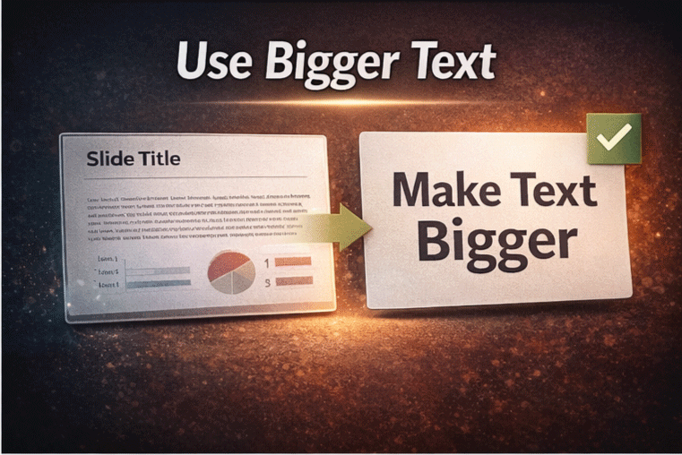
If your text looks small, it probably is.
Professional presentations rely heavily on large, clear typography. Not only does it improve readability, but it also makes your message feel more confident and direct.
Instead of long paragraphs, try using short phrases or key ideas. Think of your slide more like something people should quickly understand at a glance, not something they have to read line by line.
Align everything (this makes a bigger difference than you think)
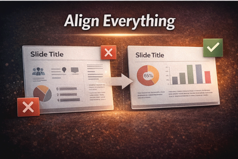
Alignment is one of those small details that completely changes how your slide feels.
You can have good content, good colors, and good typography, but if your elements are slightly misaligned, everything starts to look messy and unprofessional.
The fix is simple. Use the alignment tools inside Microsoft PowerPoint and make sure your elements follow a clear structure. Consistent spacing and clean alignment create that polished look most people are trying to achieve.
Be intentional with color
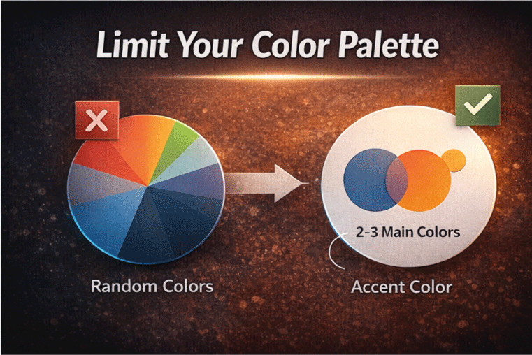
Color is another area where things can go wrong very quickly.
Using too many colors or mixing styles without a clear direction makes your slides feel chaotic. On the other hand, a limited and consistent color palette immediately makes everything look more professional.
You don’t need a complex system. Just stick to a few main colors and use them consistently throughout your presentation. That alone makes a huge difference.
Use better visuals… or none at all
Not every slide needs an image.
In fact, using low-quality or irrelevant visuals can hurt your presentation more than help it. If the image doesn’t add value or doesn’t look good, it’s better to leave it out.
Simple elements like clean shapes, icons, or even just well-structured text can be more effective than forcing visuals that don’t really belong.
Start with a good template
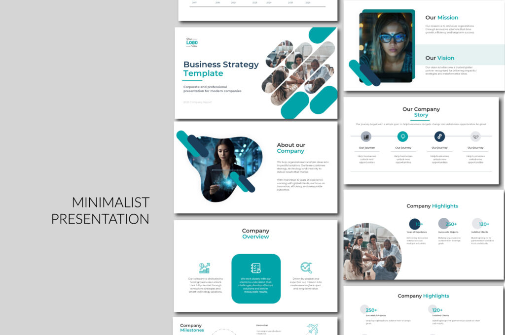
You don’t need to start from scratch every time.
Most professional presentations actually begin with a well-designed template. The difference is that a good template already has structure, consistency, and proper spacing built in, so you’re not trying to figure everything out on your own.
If you want to make things easier, you can start with ready-to-use templates that are designed to look clean and professional from the beginning. That way, you focus more on your content and less on fixing design issues.
👉 You can start with my free templates on PPThemes, which are designed to give you a solid, professional base without overcomplicating the design. And if you want to take it a step further, you can always scale with a premium template from PPTBundle for more advanced layouts and a more polished look.
Think like a storyteller, not just a designer
At the end of the day, your slides are not the presentation.
You are.
Your slides are there to support your message, not to replace it. When you focus only on design, it’s easy to forget that what really matters is how your ideas are communicated.
A professional presentation feels clear, intentional, and easy to follow—not because of how it looks, but because of how it flows.
Final Thought
Making your PowerPoint look professional is not about being a designer.
It’s about making better decisions.
Less clutter.
More clarity.
More intention.
And once you understand that…
Your presentations will instantly feel more professional.

GIPHY App Key not set. Please check settings