Let’s be honest…
Most PowerPoint presentations don’t look bad because of the tool.
They look bad because of small design mistakes people don’t even realize they’re making.
And the worst part?
You can spend hours working on your slides… and still end up with something that feels off.
Not terrible.
Just not professional.
If that’s ever happened to you, you’re not alone.
Here are the most common PowerPoint design mistakes—and how to fix them.
Using too much text
This is probably the most common mistake. And let’s be honest—you’ve seen it before. Slides packed with text, overwhelming from the first second… not exactly engaging, right?
When you try to explain everything on the slide, it quickly turns into a wall of text that no one wants to read. And the moment your audience starts reading, they stop listening.
A good slide is not a document. It’s there to support what you’re saying.
So instead of writing everything, focus on adding just a few keywords that help you remember your main points. That’s enough.
You can also use visuals like graphics, images, or icons to reinforce your message. And if you do need to include text, try organizing it into columns or small sections instead of filling the entire slide. It instantly feels cleaner and easier to follow.
If your slide looks like something you would copy and paste into Word, it’s already too much. The goal is not to say everything, it’s to highlight what actually matters.
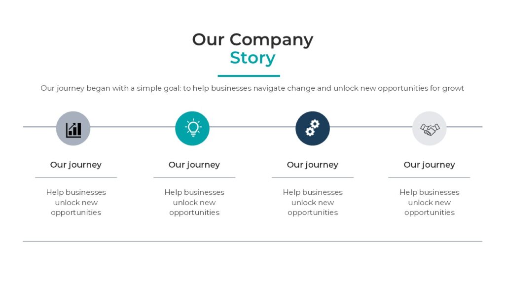
here’s an example
Trying to say too many things at once
Sometimes the problem is not just the amount of text, but the number of ideas.
One slide with a title, a paragraph, a chart, and three icons is trying to do too much. And when everything competes for attention, nothing really stands out.
A much better approach is to focus on one idea per slide. That doesn’t mean filling your presentation with 100 slides, though. It’s about using only what you need to communicate clearly.
Most presentations today usually fall somewhere between 20 to 30 slides, but the exact number isn’t the most important thing. What really matters is clarity.
And just as important as the number of slides… is the time.
Try to keep your presentation concise. In most cases, 15 to 20 minutes is more than enough to explain your ideas effectively. Attention spans are getting shorter, so the more direct and focused you are, the better your presentation will feel.
If a slide feels crowded, it’s usually a sign that it should be split into two or three slides instead.
Inconsistent alignment
This one seems small, but it makes a huge difference.
When elements are slightly misaligned, your slide immediately feels messy—even if everything else is correct.
The fix is simple: be intentional with alignment. Use the alignment tools inside Microsoft PowerPoint and keep spacing consistent between elements.
This is one of the fastest ways to make your slides look more polished without changing the content.
Using too many colors
Color can elevate your presentation… or completely ruin it.
Using too many colors without a clear structure makes your slides feel chaotic and unprofessional. It also makes it harder for your audience to focus on what really matters.
You don’t need a complex palette. A few consistent colors used intentionally will always look better than trying to use everything at once.
Overusing animations
I personally prefer not to use animations, but I have to admit—they’re not the problem.
Overusing them is.
When every element moves, fades, spins, and bounces, it becomes distracting instead of helpful. Instead of supporting your message, animations start competing with it.
Used correctly, animations should guide attention—not steal it.
Simple transitions, like Morph, can be incredibly powerful when used with intention.
Using low-quality visuals
Not every slide needs an image. And forcing visuals that don’t look good can actually make your presentation worse.
Blurry images, stretched graphics, or irrelevant icons instantly lower the quality of your slides.
If a visual doesn’t add value or doesn’t look right, it’s better to leave it out. Clean, well-structured slides with good typography often look more professional than slides overloaded with visuals.
Ignoring typography
Fonts matter more than most people think.
Using too many font styles, mixing inconsistent sizes, or not having a clear hierarchy makes your slides harder to read and less visually appealing.
Professional presentations usually keep things simple: one or two fonts, clear size differences, and consistent spacing.
Typography is not decoration. It’s structure.
Starting from scratch every time
This is something a lot of people don’t realize.
Trying to design everything from zero every single time makes the process harder than it needs to be. And it often leads to inconsistent results.
Most professional presentations start from a well-designed base.
If you want to make things easier, you can start with ready-to-use templates that already have structure, spacing, and consistency built in.
👉 You can start with my free templates on PPThemes to build a clean and professional presentation quickly. And if you want something more advanced, you can always scale with a premium template from PPTBundle.
No matter which option you choose, all of my templates are built using the best design practices I’ve shared here. Whether they’re free or paid, the goal is always the same: to deliver high-quality content that helps you create presentations that actually stand out.
Not thinking about the audience
This might be the biggest mistake of all.
Sometimes we focus so much on how the slide looks that we forget who it’s for.
A good presentation is not just visually clean—it’s easy to understand, easy to follow, and aligned with the audience.
If your slides look good but your message is not clear, the design is not doing its job.
Final thought
Most PowerPoint design mistakes are not about lack of skill.
They’re about decisions.
What to include, what to remove, how to organize information, and how to guide attention.
The good news is that once you start noticing these mistakes, they become very easy to fix.
And that’s when your presentations start to look different.
Cleaner.
More intentional.
More professional.

GIPHY App Key not set. Please check settings