Ever sat through a presentation so dull that you could swear you heard crickets chirping in the background? Yeah, we’ve all been there. But that doesn’t have to be your audience! With a few simple PowerPoint design tips, your slides can go from “yawn” to “wow” in no time.
Here are some quick, easy tips that anyone—yes, anyone—can use to make their slides pop. Let’s dive in!
1. Keep It Simple, Smarty (a.k.a. Don’t Overcrowd Your Slides)
- Why It Works: Less really is more in PowerPoint land. When you cram too much onto a slide, it’s overwhelming, and people tune out. Aim for one main idea per slide and let it breathe.
- Pro Design Tip: Use images and short bullet points instead of paragraphs. If your audience has to squint or scroll, it’s a sign to cut down the text.
- Free Template Example: Download a minimalistic template with plenty of white space that keeps each slide clean and focused—perfect for presentations with concise points and visuals.
2. Choose the Right Fonts (Please, No Comic Sans!)
- Why It Works: Fonts set the tone. The right font makes you look professional, while the wrong one… well, it might make your audience question your choices. Stick to clean, easy-to-read fonts like, Arial, Calibri, or, if you’re feeling fancy, Roboto, Lato, Montserrat.
- Pro Design Tip: Try using two fonts max: one for headers and one for body text. And make sure they’re big enough to read (at least 24pt for body text is a safe bet).
- Free Template Example: Download a professionally styled template with balanced, readable fonts that’s easy on the eyes and sets a great tone for any presentation.
3. Color It Right
- Why It Works: Color isn’t just for aesthetics; it affects mood. Blues are calm, greens are fresh, reds grab attention. Choose a color scheme that fits your presentation’s vibe and stick to it—consistency is key.
- Pro Tip: Not sure what colors work together? Use a tool like Adobe Color to find color palettes, or choose a premade template with a built-in scheme. And remember, contrast is your friend. Light text on a dark background or vice versa will make things pop.
- Free Template Example: Download a creative with color-coordinated template with a calm blue palette and plenty of contrast—ideal for engaging, visually harmonious presentations.
4. Use High-Quality Images (Skip the Clipart)
- Why It Works: A high-quality image is worth a thousand words (and definitely worth skipping that cheesy clipart from 1998). Choose crisp, relevant images that support your points and add visual interest.
- Pro Tip: Sites like Unsplash and Pexels offer free high-quality photos. Just remember to give credit if needed, and don’t go overboard—one great image per slide is usually enough.
- Free Template Example: Download a template with clean, Design-friendly layouts, so you can showcase stunning visuals without clutter.
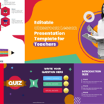
5. Make Data Fun: Use Infographics
- Why It Works: Infographics turn complex data into visual, easy-to-grasp information. They help convey numbers, processes, or timelines in a way that’s engaging and memorable, even for data-phobes!
- Pro Tip: Choose or design infographics that are simple and focused. Use icons, color-coded sections, and limit the text so it’s visually appealing and easy to understand at a glance.
- Free Template Example: Download a template with ready-to-use infographics that makes data look dynamic and professional—ideal for presentations packed with stats or processes.
6. Animations: Use Sparingly, Please
- Why It Works: We get it—animations are fun. But when every bullet point comes swooshing in from different directions, it can feel like a circus act. Instead, choose a simple effect (like fade-in) and use it sparingly, Another great option can be the Morph Transition.
- Pro Tip: Stick to one type of transition for your entire presentation, and use animations only when it adds to the message (not just for flair). Remember, subtlety is key here!
- Free Template Example: Download a PowerPoint Template with Morph Transition that add just the right touch without distracting your audience.
7. Keep Your Slides Consistent (So They Look Like They Belong Together)
- Why It Works: Consistency in layout, font sizes, colors, and images keeps your audience focused on the content, not the design. A consistent look also shows you’ve put thought and care into your presentation.
- Pro Tip: Pick a template and stick with it. PowerPoint has plenty of great templates (and hey, we offer free ones, too!). Just make sure to use the same layout for similar content.
- Free Template Example: Download a cohesive template with uniform styles as a Business Template, so your slides look like they belong together from start to finish.
Wrap-Up: Nail Your Next Presentation with Ease
With these PowerPoint design tips, you’ll have clean slides, readable fonts, the right colors, engaging infographics, and a professional layout. Each tip is designed to help you create a presentation that impresses without overwhelming. Remember, your slides are there to support you—not to steal the spotlight. Now go make that presentation, and give your audience something to remember (for all the right reasons)!
Bonus: Want a shortcut? At PPThemes, you can download professionally designed, free PowerPoint templates that incorporate all these design tips, so your presentations are always ready to impress!

GIPHY App Key not set. Please check settings